Saturday, August 8, 2015
To Paint or Not to Paint, That is the Question
I am organizing my fall painting classes. If you are interested in taking classes. Please leave a comment on this page letting me know what day and time you are interested in.

Monday, June 22, 2015
Abstract Butterflies-Paint Night
 This is not as difficult as it looks. Its difficulty is just 2 out of 5. Come paint it with me on Tuesday, July 28th 7-9:30. The cost is $25.00 all materials supplied. You can use the colors of your choice. To find out more information and sign up click here. Type the access code 333.
Saturday, June 20, 2015
Woodland Path- Paint Night
 Come paint this 16 x 20 Woodland Path with me. Click on the link below to sign up for this Paint Night Out on Tuesday, July 7th. Type the access code 333 to register. Click here to get more information or to sign up.
Wednesday, March 25, 2015
My Impression of the Sunrise is...
This is the painting that caused the term impressionism to be widely used. It shows recognizable images, but it is obviously painted. The painter was using his brushstrokes to portray his impression of the sunrise over the water. We see loosely defined boats silhouetted in the foreground and background. It was not the first impressionist painting, but since Monet used the term Impression in the title of his work, reporters began to use the term impressionism to describe this style of painting which they thought was "unfinished". It was not initially thought to be a positive thing by the public. Today it is a very popular style of art.
 |
| Impression Sunrise by Claude Monet, 1972 , Musee Marmottan Monet, Paris |

The next step was to repaint the whole surface using horizontal strokes until the whole surface is covered with paint leaving the texture of the strokes. Tiny globs of paint are okay, it adds to the painting.

The next step is to sketch some silhouettes that you think you would like to use in your painting. This was our homework. Next week we will add the silhouettes to our paintings.

We will use a dark gray to black color to add silhouettes to the paintings. A large silhouette of an object in the foreground and a reduced sized object in the background. And voila, your very own Impressionist Sunrise painting.

Friday, March 13, 2015
Back to the Future
Futurism is a style of art that began in the early 1900's. It often resembles cubism. The key to futurist art is that it deals with the future often showing movement, mechanical items, and powerful things. Below is a picture with a cubist feel that portrays a horse in motion. Below that is a picture of a dog being walked.

%2C_oil_on_canvas%2C_100_x_100_cm%2C_Museo_del_Novecento.jpg/640px-Umberto_Boccioni%2C_1912%2C_Elasticity_(Elasticit%C3%A0)%2C_oil_on_canvas%2C_100_x_100_cm%2C_Museo_del_Novecento.jpg) |
| " Elasticity (Elasticità), oil on canvas, 100 x 100 cm, Museo del Novecento" by Umberto Boccioni |
%2C_Albright-Knox_Art_Gallery.jpg/220px-Giacomo_Balla%2C_1912%2C_Dinamismo_di_un_Cane_al_Guinzaglio_(Dynamism_of_a_Dog_on_a_Leash)%2C_Albright-Knox_Art_Gallery.jpg)
Giacomo Balla, 1912, Dinamismo di un Cane al Guinzaglio (Dynamism of a Dog on a Leash), Albright-Knox Art Gallery
Our class began our own movement art inspired by futurism. Here is a link to view several examples of our assignment.
We traced our mannequin with pencil, then traced it with watercolor pencils and colored pencils. The last step is to use a damp brush to "paint" areas to enhance the motion.
Thursday, February 26, 2015
5 Eyes Wide
The human face is basically 5 eyes wide. This is a standard measurement artists use to draw a portrait. Peoples faces vary slightly from this; some have slightly more than an eye width between their two eyes and some have slightly less space. The middle school class drew a front view line drawing similar to this, first in pencil and then tracing over it in Sharpie.

We divided the paper vertically and horizontally. Next we made tick marks 1/2 inch to each side of the center on the horizontal line. Then we made 2 tick marks on each side 1 inch apart beginning at the 1/2 inch tick. On the vertical line we made tick marks going up and down 4 inches each way. Using those marks we drew an egg shape that was 5 inches by 8 inches with the narrow end down. Using a diagram similar to the one below we added eyes, a nose, mouth and eyebrows.

We divided the paper vertically and horizontally. Next we made tick marks 1/2 inch to each side of the center on the horizontal line. Then we made 2 tick marks on each side 1 inch apart beginning at the 1/2 inch tick. On the vertical line we made tick marks going up and down 4 inches each way. Using those marks we drew an egg shape that was 5 inches by 8 inches with the narrow end down. Using a diagram similar to the one below we added eyes, a nose, mouth and eyebrows.
Monday, February 16, 2015
You Crack Me Up...
When most people think of Cubism they usually think of Picasso and fractured portraits. The portrait below is not by Picasso, but it is a portrait of Picasso by an artist named Juan Gris. Notice the shading and how bland the coloring is. This was typical of early cubist art.
 |
| Juan Gris, Portrait of Picasso, 1912, oil on canvas, Art Institute of Chicago |
%2C_oil_on_canvas%2C_63.5_x_78.7_cm_(25_x_31_in)%2C_Columbus_Museum_of_Art%2C_Ohio.jpg/180px-thumbnail.jpg) |
| 1914–15, Nature morte au compotier (Still Life with Compote and Glass), oil on canvas, 63.5 × 78.7 cm (25 × 31 in), Columbus Museum of Art, Ohio Cubism evolved. Bright colors, multiple views, abstract images and geometric shapes are all associated with cubism now. Cezanne, Braque and Picasso are some of the main cubist artists. |
Thursday, February 5, 2015
From Your Point of View...
Part of creating art that has some hint of realism is learning to create art using perspective. Most students begin with 1 or 2 point perspective. I usually teach 1 point perspective first. There is a great handout available free at Teachers Pay Teachers. Click here to get your handout.
This is my sample completed with markers.Notice how the trees get smaller just as the buildings do. Also the things closer to the viewer overlap the things farther away.

Below is a simplified version of the above drawing using a corner to corner x across the paper to create the vanishing point and areas for the top, sides and bottom of the landscape. This drawing was inspired by Peter Max, a pop artist who began his career in the 1960's. I'll be finishing it this week in my Elementary Art co-op class.
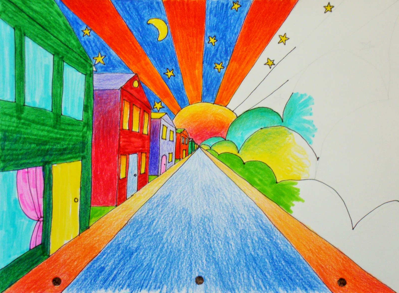
In the following 1 point perspective drawing there is no horizon line because we are viewing from a birds eye view. The extra depth is created by using a cascade of balloons of various sizes and darker shading at the base of the buildings.

Tuesday, January 13, 2015
Art Can Be a Dream...
Next week the co-op art classes will begin working on their dream art work. What I mean is Surreal Art. Surreal Art is a style of art that began in the early 1920's in which the artist expresses himself in a dream like fantasy art work. Salvador Dali and Rene Magritte are two well known surreal artists.
This is the painting, The Persistence of Memory by Salvador Dali.


This is the painting, The Persistence of Memory by Salvador Dali.

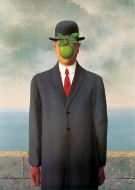
The following is a painting by Rene Magritte titled The Son of Man.
Its amazing what my students were able to create with some magazines, glue, scissors, and paper. Here is a surreal collage by one of my middle school students.
Wednesday, October 15, 2014
Tulsa and Art Deco Go Together
For the last few weeks our Elementary class has been learning about Art Deco. We viewed a selection of posters and saw all the or their skylines, sunbursts, spotlights, and beautiful shading. The students combined these elements to make 9x12 posters. Here they are-

Monday, October 13, 2014
Sparkly,Fuzzy, Shiny, Matte...
Texture!
Texture is everywhere. It's the smooth surface of soft leather, the fluffy fur of a stuffed animal, the shiny glass jar, the bumpy brush strokes on a painting or the rough bark of a tree. Texture is the way a surface is perceived in art. Actual texture is the real way things look and feel.
Visual texture is the illusion of texture. It is making a 2 dimensional piece of art appear as if it is 3 dimensional. It's a painting of a tree that makes the bark appear as if it is rough or a drawing of a fluffy kitten that looks soft.
Have you ever seen a wood floor and then realized that it is not wood but vinyl, tile, or stained concrete? That is an example of simulated texture. It's imitating the texture of something.
When you make up your own texture in a work of art it is called invented texture. Painters sometimes mix things with their paint to make the surface feel and look different.
Rough surfaces are bumpy, not smooth. A smooth surface is even and free from bumps. Shiny surfaces reflect light and images; they are very smooth. Matte surfaces are dull and smooth; they reflect very little. Below are some examples of each.
Rough- sandpaper, a dirt road, tree bark
Smooth- CD, tabletop, satin fabric
Shiny- the surface of water, glass, jewelry
Matte- leather, notebook paper, skin
Texture is everywhere. It's the smooth surface of soft leather, the fluffy fur of a stuffed animal, the shiny glass jar, the bumpy brush strokes on a painting or the rough bark of a tree. Texture is the way a surface is perceived in art. Actual texture is the real way things look and feel.
Visual texture is the illusion of texture. It is making a 2 dimensional piece of art appear as if it is 3 dimensional. It's a painting of a tree that makes the bark appear as if it is rough or a drawing of a fluffy kitten that looks soft.
Have you ever seen a wood floor and then realized that it is not wood but vinyl, tile, or stained concrete? That is an example of simulated texture. It's imitating the texture of something.
When you make up your own texture in a work of art it is called invented texture. Painters sometimes mix things with their paint to make the surface feel and look different.
Rough surfaces are bumpy, not smooth. A smooth surface is even and free from bumps. Shiny surfaces reflect light and images; they are very smooth. Matte surfaces are dull and smooth; they reflect very little. Below are some examples of each.
Rough- sandpaper, a dirt road, tree bark
Smooth- CD, tabletop, satin fabric
Shiny- the surface of water, glass, jewelry
Matte- leather, notebook paper, skin
Thursday, October 2, 2014
And It Keeps Running...
We played with watercolor again in class, learning how to control it better. We tried several resist methods also. Here are the fruits of 2 running watercolor/pen projects.

Sunday, September 28, 2014
My Impression Is...
Since we are working on acrylic paintings in class this week we need to let them dry. The Middle School class homework is to investigate an impressionist artist. Below are links for the paintings on the handouts and an information website link about each artist.
Students were to read about their artist, make notes on the handout, view the painting on the computer and color their picture with colored pencils. Next week we finish our landscapes.
Paul Cezanne
The-Kitchen-Table by Cezanne
Edouard Manet
The_Railway by Manet
Claude Monet Info
Sailboats-on-the-Seine by Monet
Students were to read about their artist, make notes on the handout, view the painting on the computer and color their picture with colored pencils. Next week we finish our landscapes.
Paul Cezanne
The-Kitchen-Table by Cezanne
Edouard Manet
The_Railway by Manet
Claude Monet Info
Sailboats-on-the-Seine by Monet
Thursday, September 25, 2014
Tone That Painting
This week the Middle School Co-op Class received their acrylic paint kits. The kits consisted of a plastic box with a lid, 5 tubes of paint, brushes, paper towel, and parchment paper. The paper towel and parchment gets moistened and placed on the lid which becomes their palette. After students are finished for the day the bottom of the box becomes the lid to keep the paints moist for the next time they paint. This is called a wet palette.
The students are beginning their acrylic painting experience by painting an Abstract Minimalist Landscape. After discussing the feelings that different colors evoke, students chose a color to tone their painting surface.
Abstract art is art where artists use color, line, form, and the other elements of art to interpret a subject. It does not realistically resemble the subject. Minimalism means that the subject is overly simplified, very, very few if any details are presented. Many Abstract Minimalist Landscape paintings consist of bands or swaths of color representing the foreground, middle ground, background and sky.
Here is a link to an artist's online gallery who creates Minimalist Landscapes. Her name is Toni Grote. Many of her landscapes I would consider to be Abstract Minimalist Landscapes.
The students are beginning their acrylic painting experience by painting an Abstract Minimalist Landscape. After discussing the feelings that different colors evoke, students chose a color to tone their painting surface.
Abstract art is art where artists use color, line, form, and the other elements of art to interpret a subject. It does not realistically resemble the subject. Minimalism means that the subject is overly simplified, very, very few if any details are presented. Many Abstract Minimalist Landscape paintings consist of bands or swaths of color representing the foreground, middle ground, background and sky.
Here is a link to an artist's online gallery who creates Minimalist Landscapes. Her name is Toni Grote. Many of her landscapes I would consider to be Abstract Minimalist Landscapes.
Next week we will (hopefully) paint the sky, background, middle ground and foreground. Students were to paint a trading card this week and if they had time to tone the canvas covers of their Art Journals.
The Primaries
The Style or De Stijl. It sounds classy. You probably recognize the pattern of many De Stijl paintings. The artwork consists mainly of rectangles,squares,stripes,the primary colors, black and white. Are these hard and fast rules? No.
The students are finishing their De Stijl geometric projects using paper,glue and markers this week. Here is the example I made to show the students; it is reminiscent of the art work of Piet Mondrian.


The students are finishing their De Stijl geometric projects using paper,glue and markers this week. Here is the example I made to show the students; it is reminiscent of the art work of Piet Mondrian.
Here are some of the works by students-
Next week we will begin to learn about Art Deco, Values and Shading.
Thursday, September 11, 2014
Cooler, Now You're Getting Warmer, Warmer

This week the Co-op Middle School Art Class learned about color theory. We completed a color wheel handout which defined and/or demonstrated the basic color theory terms. These color theories were then applied in a Warm/Cool Drawing. Simple designs were created on a paper with a grid of approximately 1-2 inch squares. The goal was then to color each section of the main design using cool and neutral colors and the background with warm and neutral colors or the reverse of that. Designs were to be simple like a tree, an owl, a basketball, a shape, a letter, et cetera. To the right is a work in progress the yellow squares in the background will be colored over with green pencil to create yellow green squares. The owl will be in colors ranging from yellow to red-violet and the background yellow-green to violet.

Notice that I am cooling the yellows in the background with greens and blues. I also toned the wing on the right with red.

These are a couple of drawings by the students-


This is my completed drawing with a cool background and warm main design.
Next week we will use color to portray depth and practice color mixing by painting an Abstract Minimalist Landscape in acrylics.
Pop Goes the Op Art!
This week the Co-op Elementary art class experienced Op Art which is short for Optical Art. It's geometric, bright, and makes the eyes see an illusion of depth or sometimes movement. We began by learning a design we called, circus tent. Some students went on to learn a second design, which we called yarn. We learned our designs using markers and 4.5x6 inch cards. The students homework was to do a 9x12 drawing using the patterns we learned, or by trying one of the ones below.
These designs are step by step. New lines are added in red. When using a pencil to make a guide line, make your lines very, very light.
"Circus tent" is the first design. It can be colored as desired. It helps the design pop if you use checkerboard style coloring.

Here are two of the students drawings using the circus tent like design.

The next design we called "Yarn". Color the ends of the "poofs" darker which adds to the illusion of depth.

This is an extra design that wasn't covered in class. It can be done with a foot outline, hand outline, or a large shape such as a star. The shape outline is done lightly in pencil and erased after the drawing is finished. This drawing I call "Relief."

These designs are step by step. New lines are added in red. When using a pencil to make a guide line, make your lines very, very light.
"Circus tent" is the first design. It can be colored as desired. It helps the design pop if you use checkerboard style coloring.
Here are two of the students drawings using the circus tent like design.
This is an extra design that wasn't covered in class. It can be done with a foot outline, hand outline, or a large shape such as a star. The shape outline is done lightly in pencil and erased after the drawing is finished. This drawing I call "Relief."
Next week we will learn about De Stijl art. We will use pencils, paper and glue.
Friday, September 5, 2014
Hurry Draw Faster
This week, Art 101 learned a technique to help capture images faster, gesture drawing. It is a way to quickly draw people and things usually using quick light lines. Since it is a quick method it is normally used to draw things when time is an issue; whether it is a moving subject or a still object which will be moved to a different place in a short time. We drew people, coffee mugs and flower pots in short intervals. These are the samples I showed in class.

Next week we will be using our new sketching techniques to create a finished piece of art.
Thursday, August 28, 2014
Art 101 Begins!
My basic art class, Art 101 launched Tuesday morning. It's a small class that meets in my studio. I painted some of my furniture white and the difference it makes is amazing. The space looks less cluttered and large.

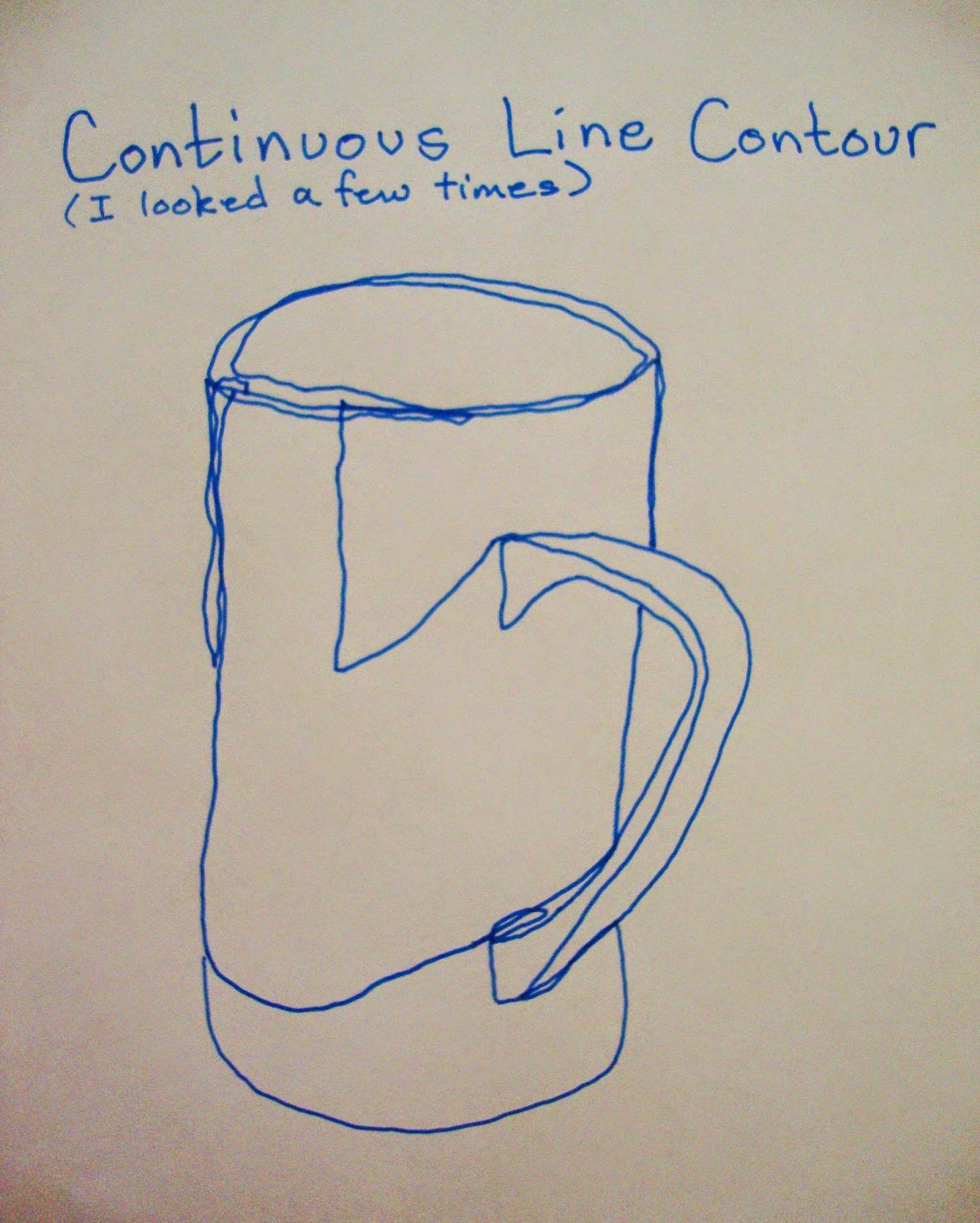

After a brief lesson about pencils and paper we went on to begin learning about line and contour drawing. Contour drawing is one of the best exercises a person can do to help coordinate their hand and eye movements. It also can be used to render subjects in fine art works.
Contour drawings can be done several ways-
- Blind, eye following the edges of the subject while the hand draws them
- Blind with peeks, looking only to place a pencil,but not looking when drawing
- Looking as much as desired
- Tracing edges on photographs
- Another form of contour drawing refers to the surface of a shape, such as contour maps
The students did very well with their work. Below are two of the students' works.
Next week we move on to gesture drawing.
Wednesday, August 27, 2014
Folk Art Goes Abstract
Week 2 at the Co-op is complete. The elementary class learned about watercolor pencils today and we continued working on our folk art pieces from last week. We also looked at some contemporary folk art from the following artists. These are their websites-
Wilson and Wilson Folk Art, Eureka Springs AR
Cathy Horvath-Buchanan, Artist, Canada
Karla Gerard, Artist, Maine
The middle school class worked on finishing their art pieces from last week and learned about pattern in art. They began an abstract folk art work that used doodle designs in combination with a folk art design to produce an abstract folk art piece with lots of patterns.

These are Abstract Folk Art works by 2 of my Middle School students. Aren't these exciting designs?
 |
| This is my Abstract Folk Art. Notice the patterns. I haven't finished coloring this drawing. I'll switch to the finished one as soon as it is complete. |
Wilson and Wilson Folk Art, Eureka Springs AR
Cathy Horvath-Buchanan, Artist, Canada
Karla Gerard, Artist, Maine
The middle school class worked on finishing their art pieces from last week and learned about pattern in art. They began an abstract folk art work that used doodle designs in combination with a folk art design to produce an abstract folk art piece with lots of patterns.
These are Abstract Folk Art works by 2 of my Middle School students. Aren't these exciting designs?
Subscribe to:
Posts (Atom)